Flutter Tooltip
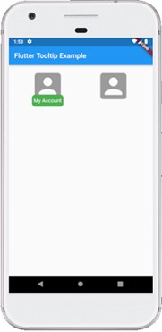
A tooltip is a material design class that can be used as text labels to tell the functionality of a user interface action. In other words, it shows additional information to the user when he moves or points over a particular ui. It increases the accessibility. If we wrap the child with it to provide the useful info.
Properties:
The following are the properties used to customize the application.
- message: message used to display in the tooltip.
- height: specifies the height of the tooltip’s child.
- textStyle: style for the message of the tooltip.
- margin: determines the empty space around the tooltip.
- showDuration: specifies the time for showing the tooltip when long press is released. By default, it’s 1.5 seconds.
- decoration: defines the shape and background color of the tooltip. Default shape is a rounded rectangle that has a border-radius of 4.0 pixels.
- verticalOffset: determines the vertical gap between the tooltip and the widget.
Example
    import 'package:flutter/material.dart';

    void main() {runApp(MyApp());}

    class MyApp extends StatelessWidget {
      @override
      Widget build(BuildContext context) {
        return MaterialApp(
            home: MyHomePage()
        );
      }
    }

    class MyHomePage extends StatefulWidget {
      @override
      _MyHomePageState createState() => _MyHomePageState();
    }

    class _MyHomePageState extends State {
      @override
      Widget build(BuildContext context) {
        return Scaffold(
          appBar: AppBar(
            title: Text("Flutter Tooltip Example"),
          ),
          body: Row(
              mainAxisAlignment: MainAxisAlignment.spaceEvenly,
              children:[
                Container(
                  margin: EdgeInsets.all(10),
                  child: Tooltip(
                      waitDuration: Duration(seconds: 1),
                      showDuration: Duration(seconds: 2),
                      padding: EdgeInsets.all(5),
                      height: 35,
                      textStyle: TextStyle(
                          fontSize: 15, color: Colors.white, fontWeight: FontWeight.normal),
                      decoration: BoxDecoration(
                          borderRadius: BorderRadius.circular(10), color: Colors.green),
                      message: 'My Account',
                      child: FlatButton(
                        child: Icon(
                          Icons.account_box,
                          size: 100,
                        ),
                      )),
                ),
                Container(
                  margin: EdgeInsets.all(10),
                  child: Tooltip(
                      message: 'My Account',
                      child: FlatButton(
                        child: Icon(
                          Icons.account_box,
                          size: 100,
                        ),
                      )
                  ),
                )
              ]
          ),
        );
      }
    }
Output